My Master Bathroom Update With Delta® Part 2 Reveal
This is a sponsored conversation written by me on behalf of Delta®. The opinions and text are all mine.
We are finally done with our master bathroom! It took about a month to complete it and you’ll never guess who I hired to help me. My dad! He’s a contractor so it was a no brainer. But here’s the kicker, we haven’t really talked in over 15 years. So, I guess we were not only renovating my bathroom but also rekindling our relationship at the same time. It was a good feeling and this ultimately turned out to be a meaningful experience. Overall, the renovation went smoothly. Let’s dive right into the whole shebang!
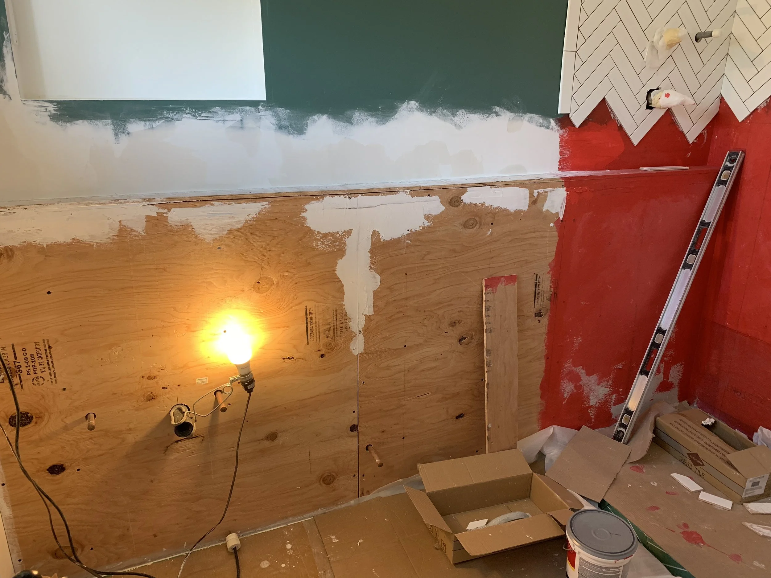
There was not a single thing we saved in this bathroom, except for a recessed light in the shower. We even had to swap out the exhaust fan because it wasn’t venting the air outside. Gasp! It was blowing moisture into our tiny seven inch attic space. Double gasp! Luckily there was no mold. My dad commented how badly the bathroom was done, too, so ripping up everything was fantastic feeling. Once everything was gone, we patched and prepped for installation. Now here comes the fun part!
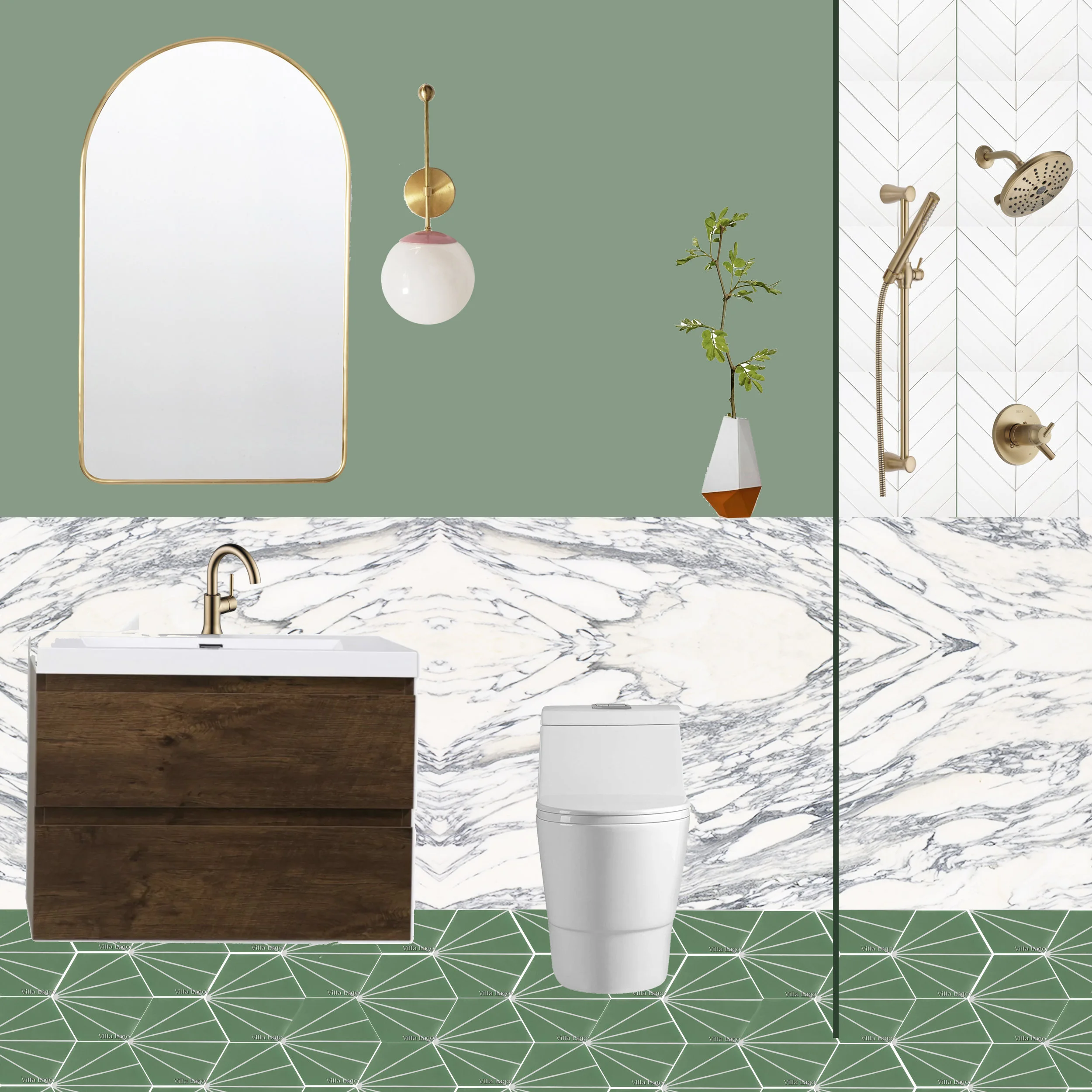
Remember I had a few design options? I decided to go with design number three. The other two are beautiful, but it requires a lot of intricate tiling. Since we have a tight deadline and budget, it pretty much dictated the direction, which is often the case. My dad was relieved to know he didn’t have to tile the entire bathroom walls. Haha.
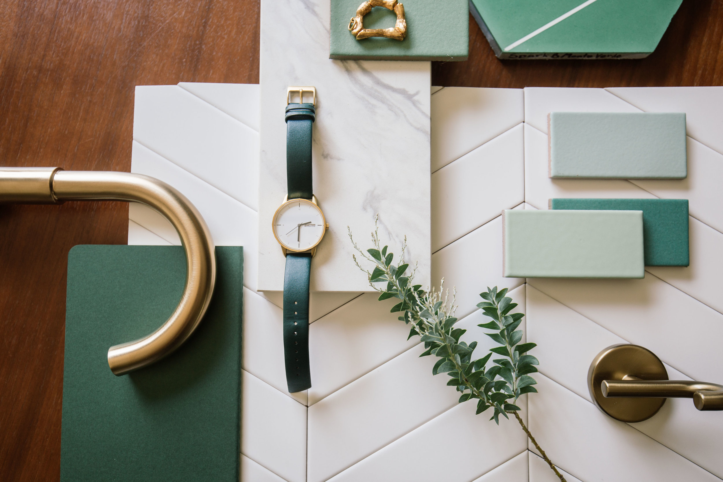
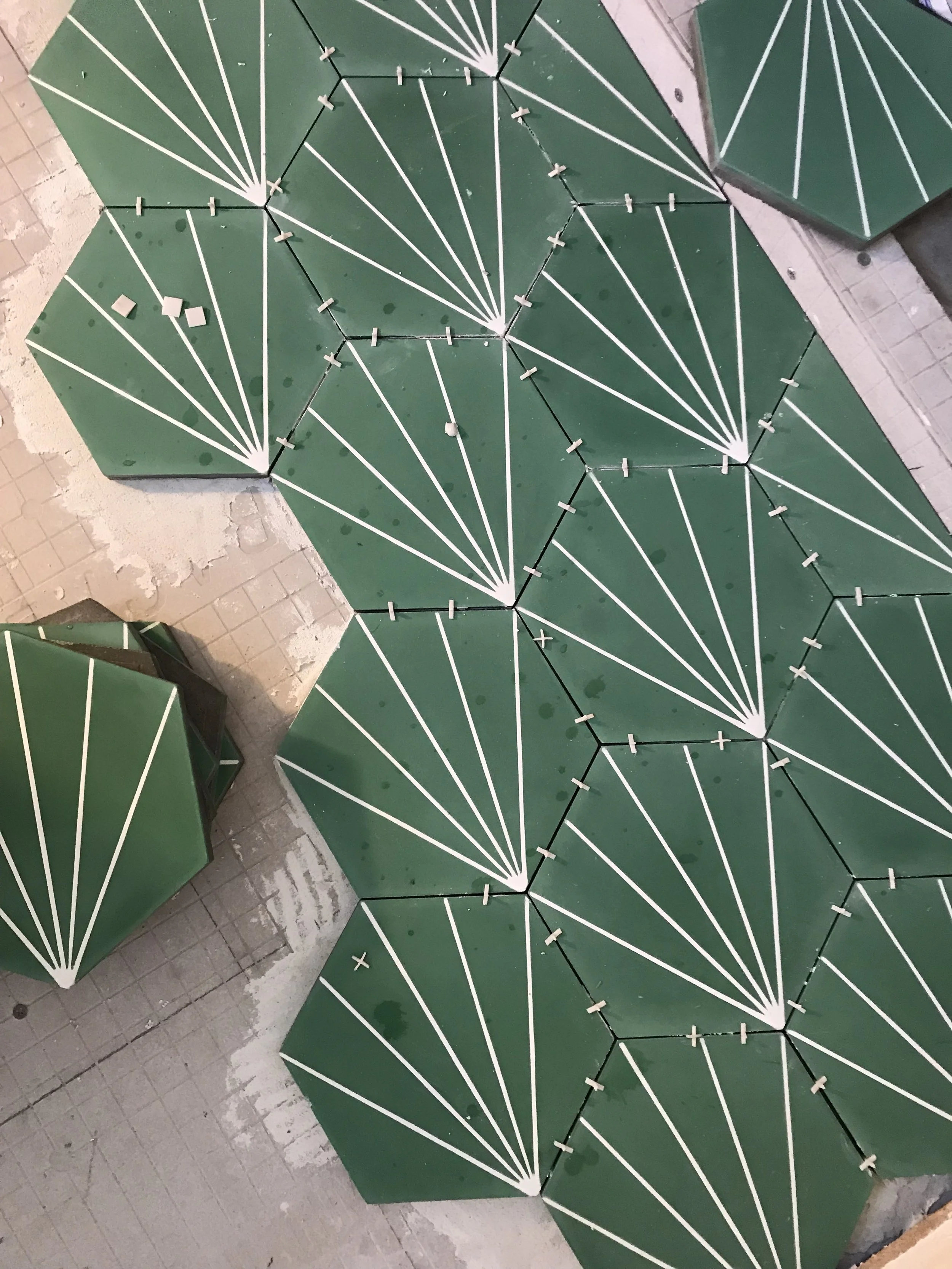
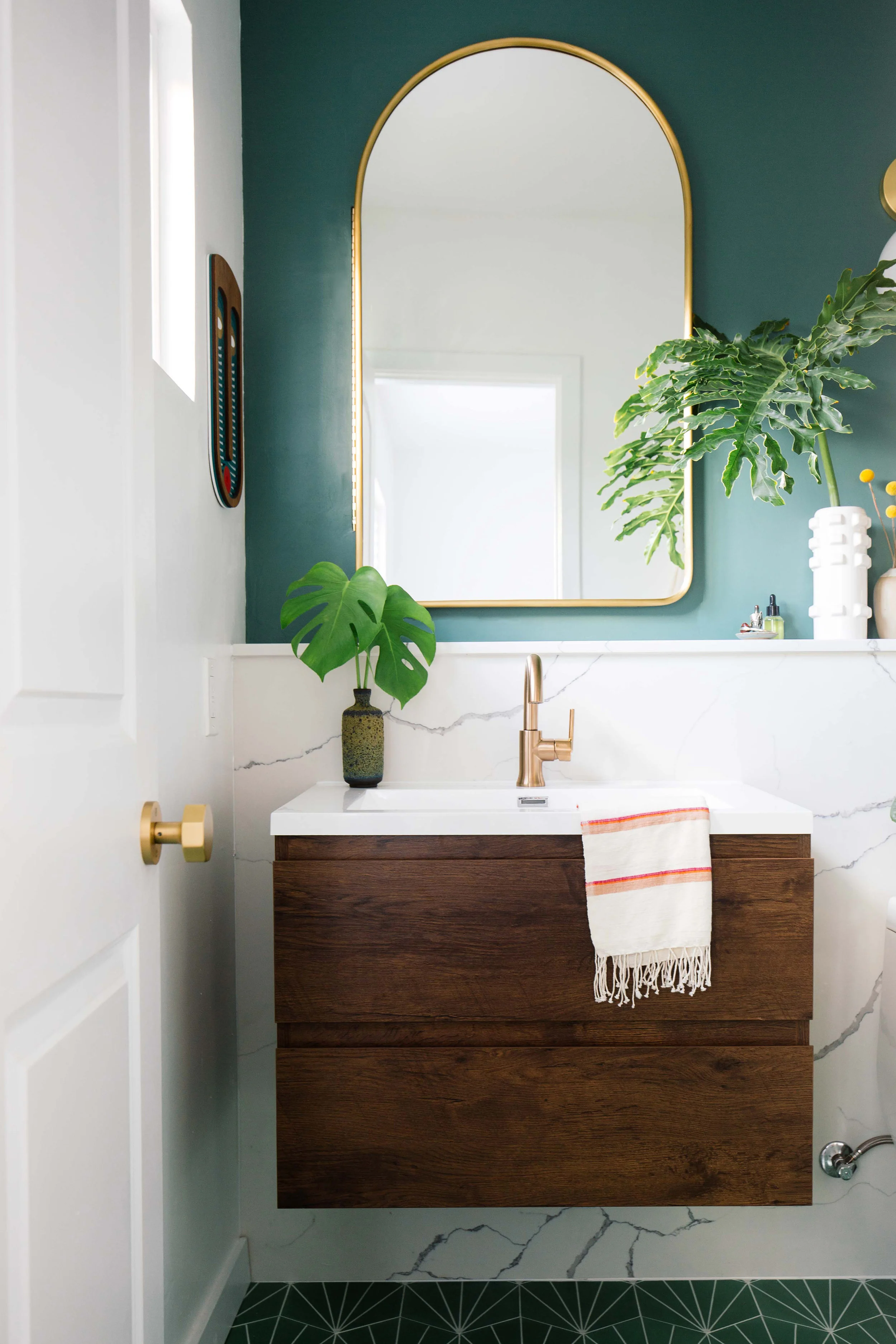
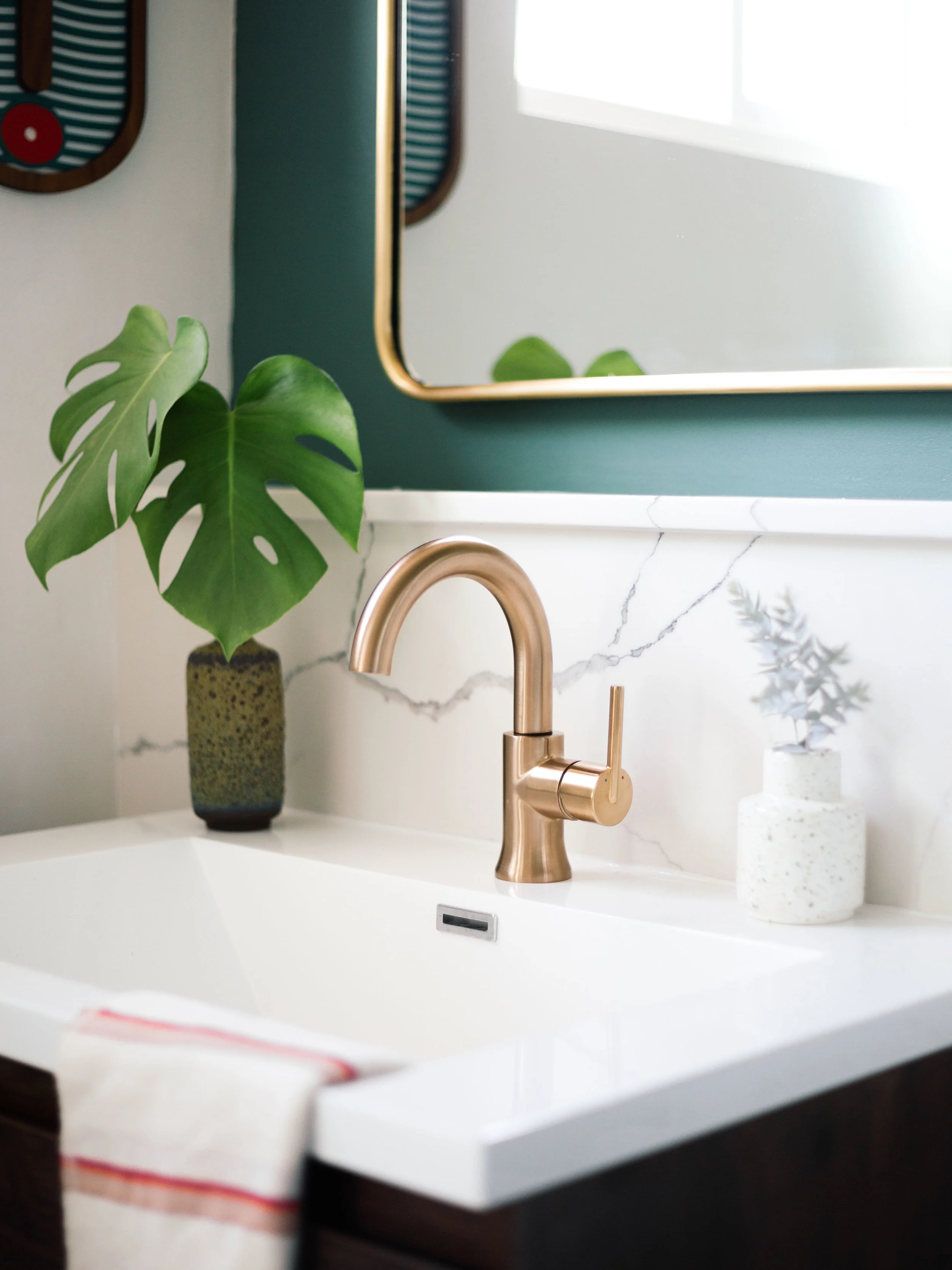
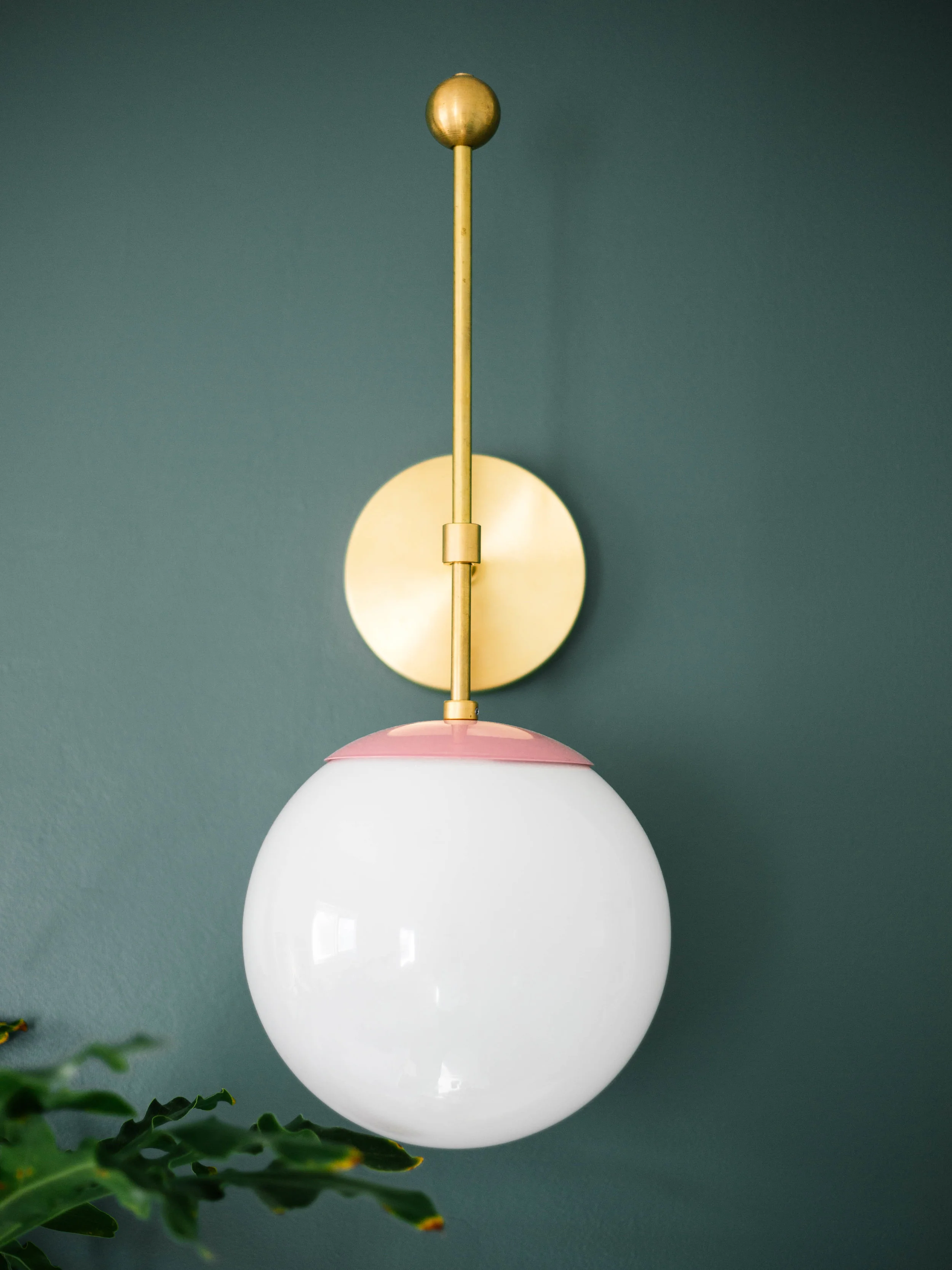
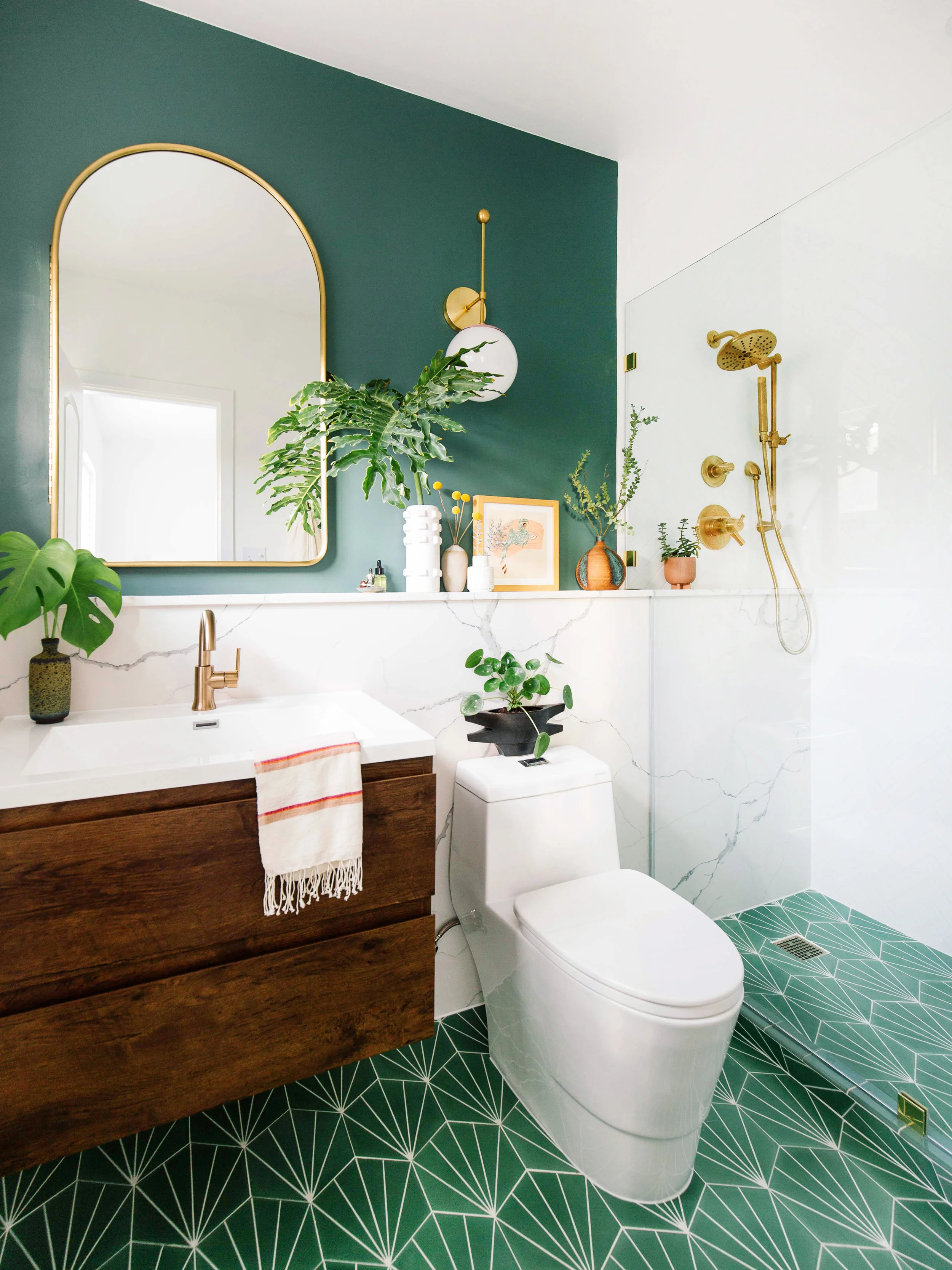
It’s hard for me to articulate my design process because it’s so instinctual. For this bathroom, I wanted to bring a big impact into this small space. I started out by choosing materials first. It was a nice change because I typically hit the ground running with color. I chose the Trinsic collection from Delta® in Champagne Bronze because I gravitated towards its elegant curves and clean lines and knew it would pair well with my modern, graphic sensibility. It has a neutral gold tone that compliments any color palette. The bathroom mood is inspired by an acacia tree from my backyard and it led me to find these green cement tiles that reminded me of it for the floors.
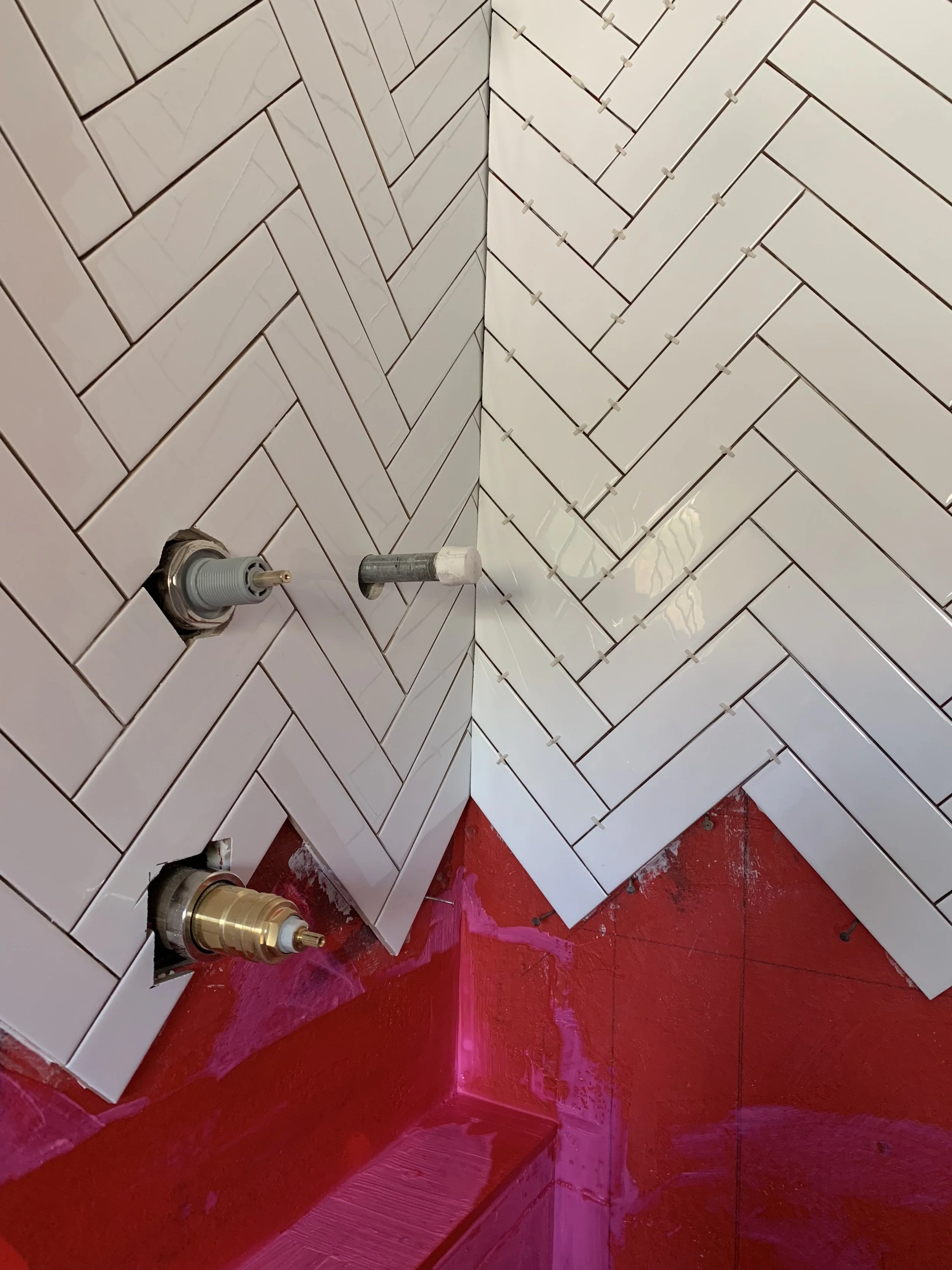
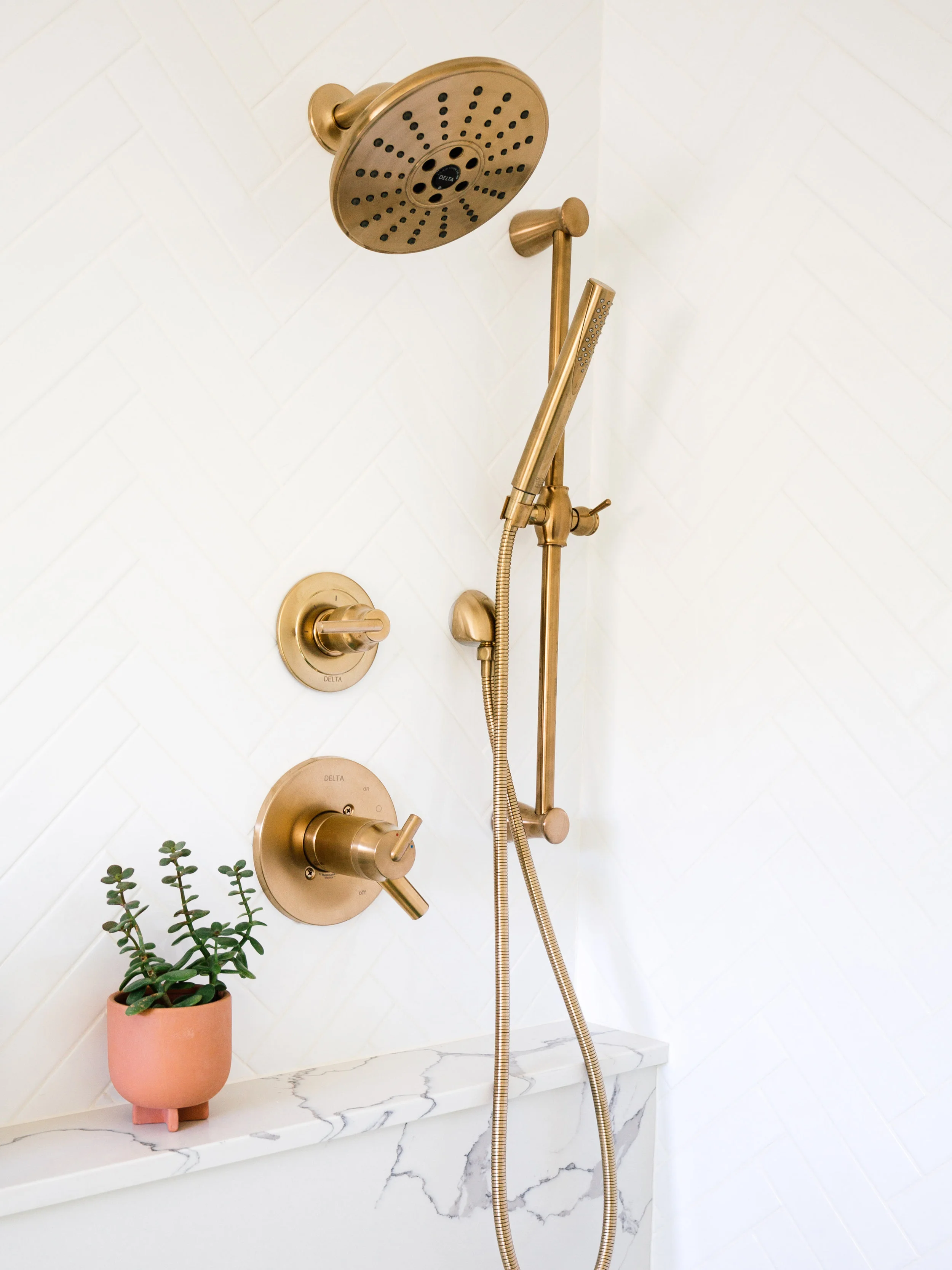
Quick thing about cement tiles, they require extra care during the process. I learned a lot from my last bathroom reno. This time around, I sealed the tiles before installation to protect the tiles from stains (grout, thinset, etc.). I applied a bright white grout using 1/16th grout lines which added more lines to the pattern and I love it. Different grout colors and grout widths can really change the look and feel of your space so it’s something to consider. Another example are these herringbone tiles. I used 2x8 white glossy subway tiles and it felt like it took light years to install them, but it was also kinda therapeutic. The entire bathroom was very matte so I wanted the shower wall to stand out with a sheen. I chose white grout because it would’ve been way too busy had I used a darker one. And white on white hides any imperfections in the tiling. The red you see is a waterproof membrane.
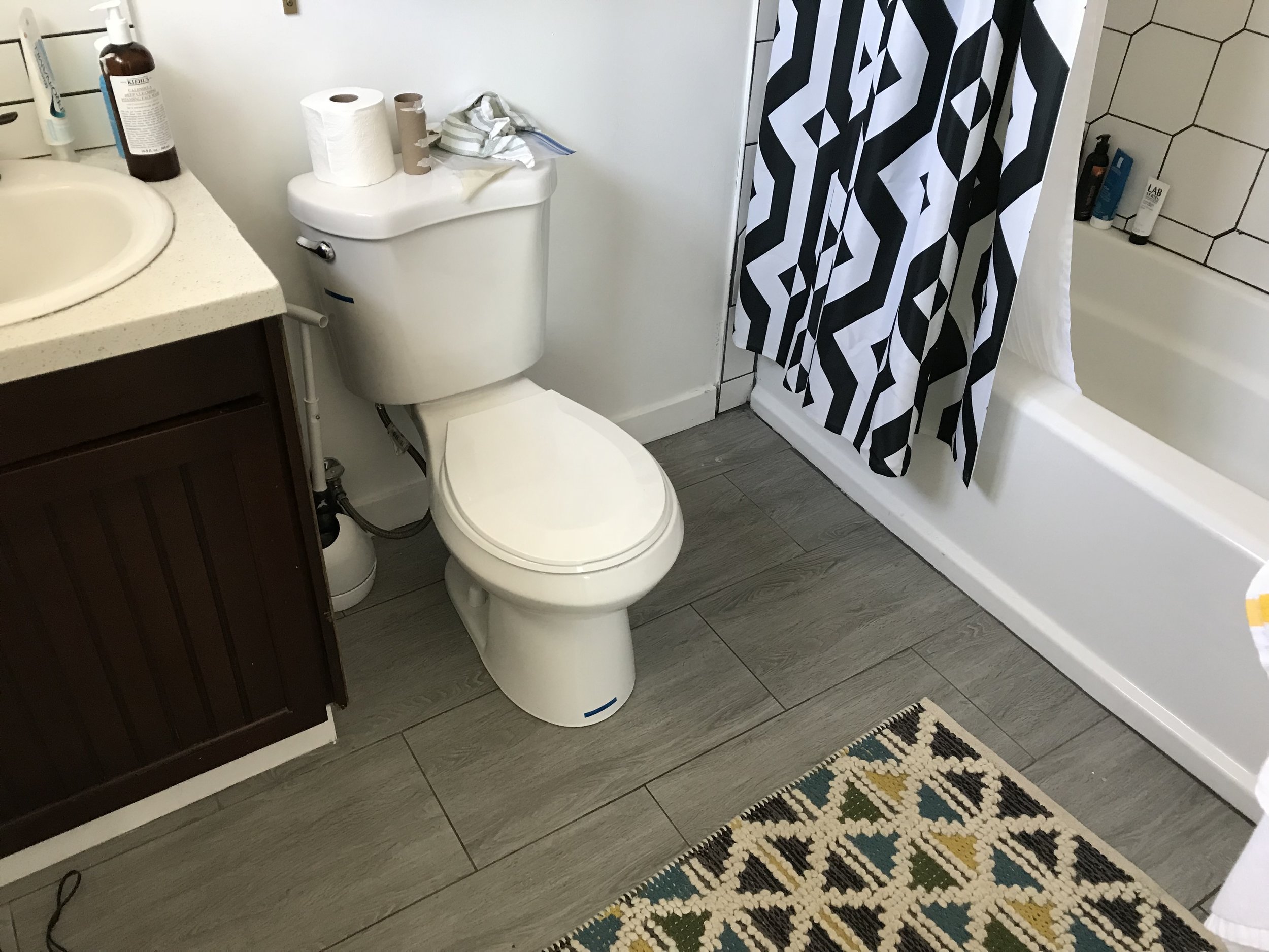
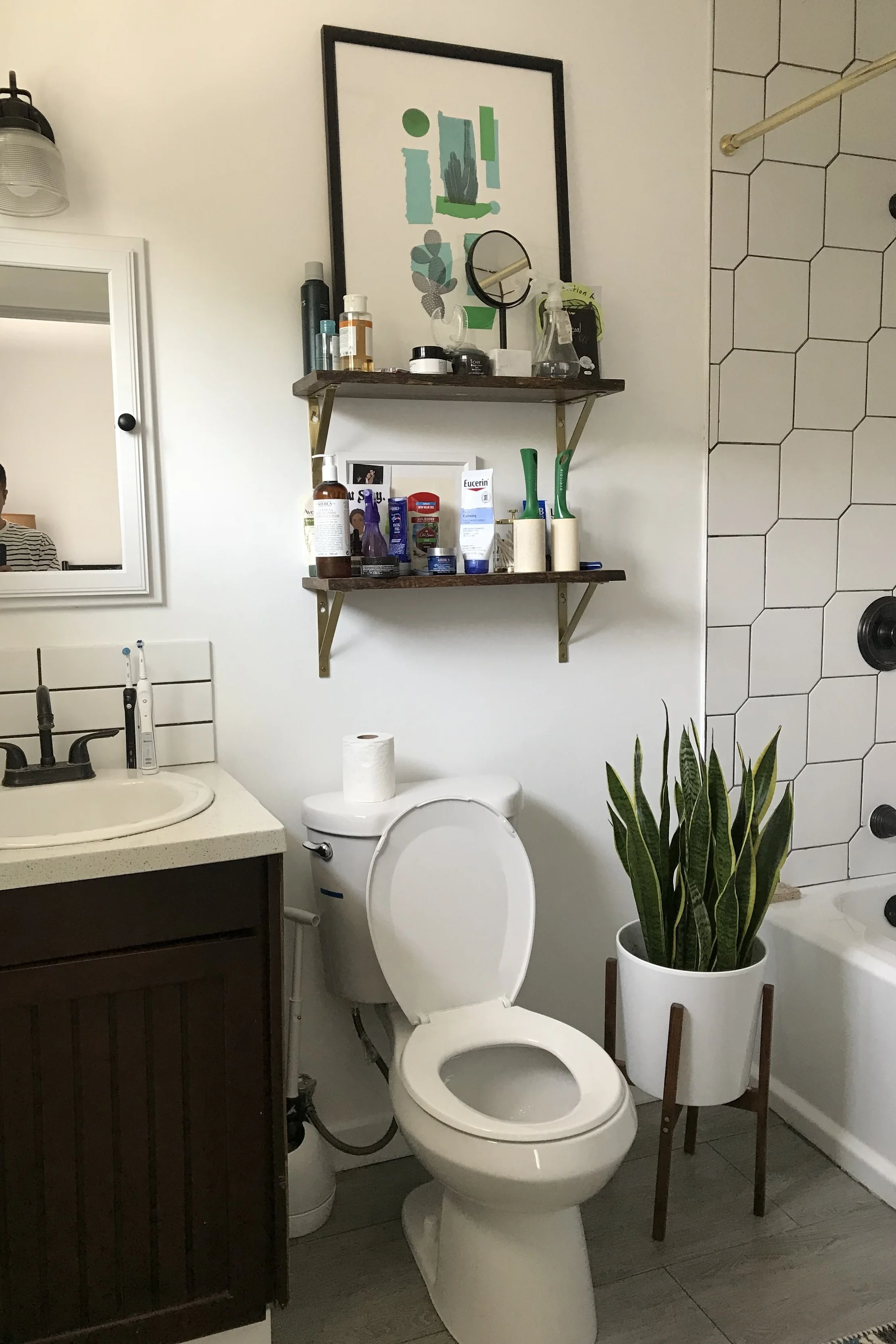
Anywho, I’m sure y’all wanna see more of the after, so here ya go! But let’s backtrack to what our bathroom looked like.
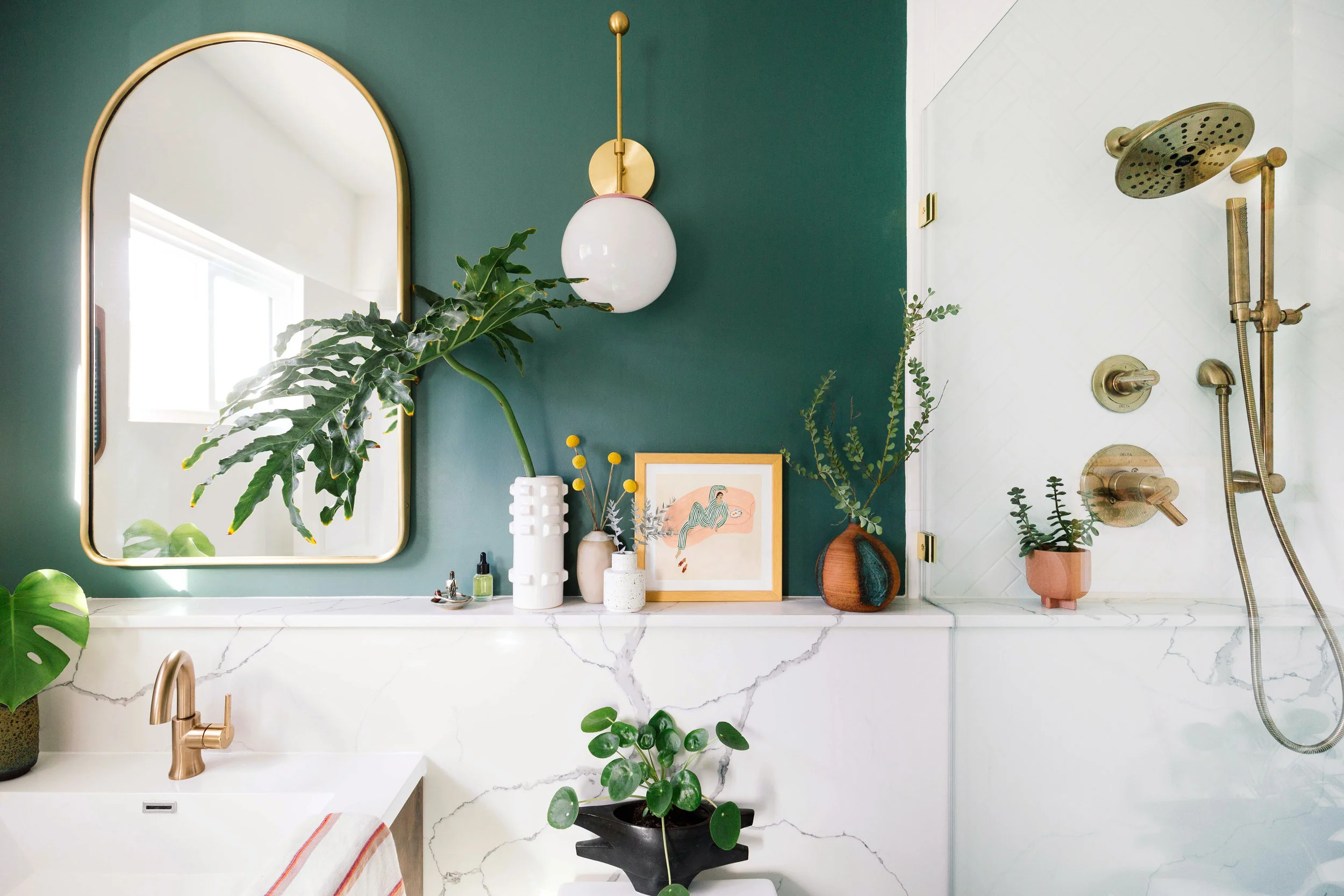
Yaaas! Welcome to my bathroom oasis!
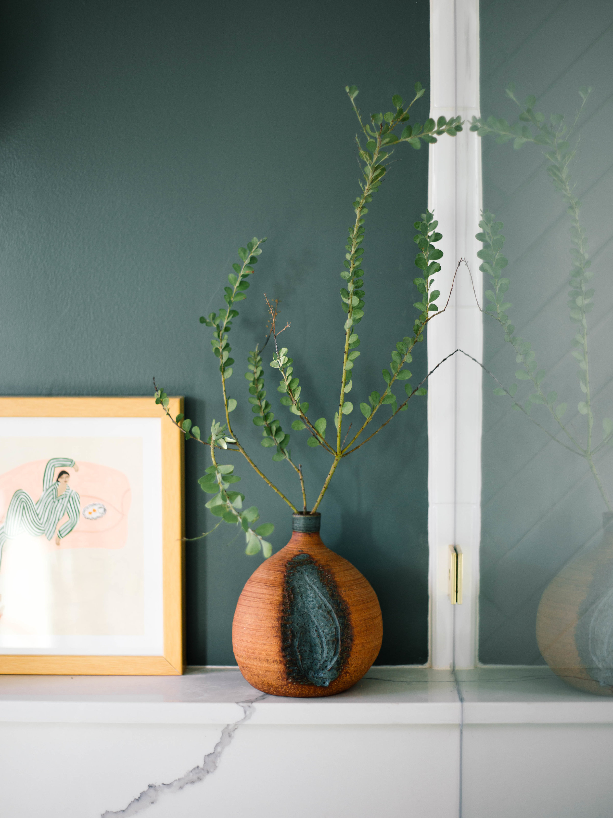
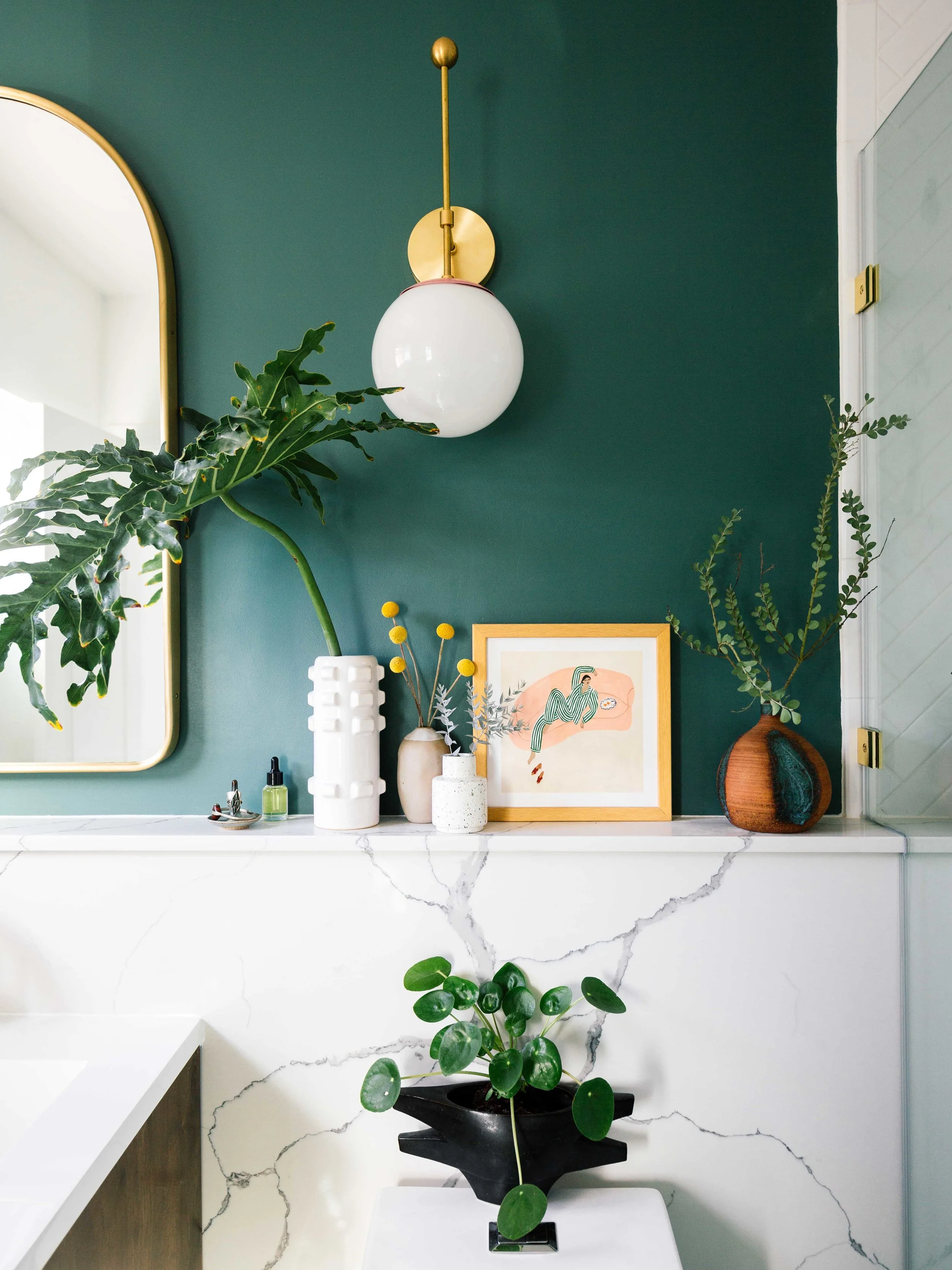
Now, let’s talk about this ledge that runs along this entire wall. It’s 101” w x 44” h x 5” d quartz with grey veins. It’s called Calacatta Alaska. To save a few nickels and dimes, I actually got a pre-fab slab. This adds more surface space to put my toiletries. But to be honest, I just wanted to put more plants and art!! Is it me or does it elongate the bathroom wall so it feels bigger too?
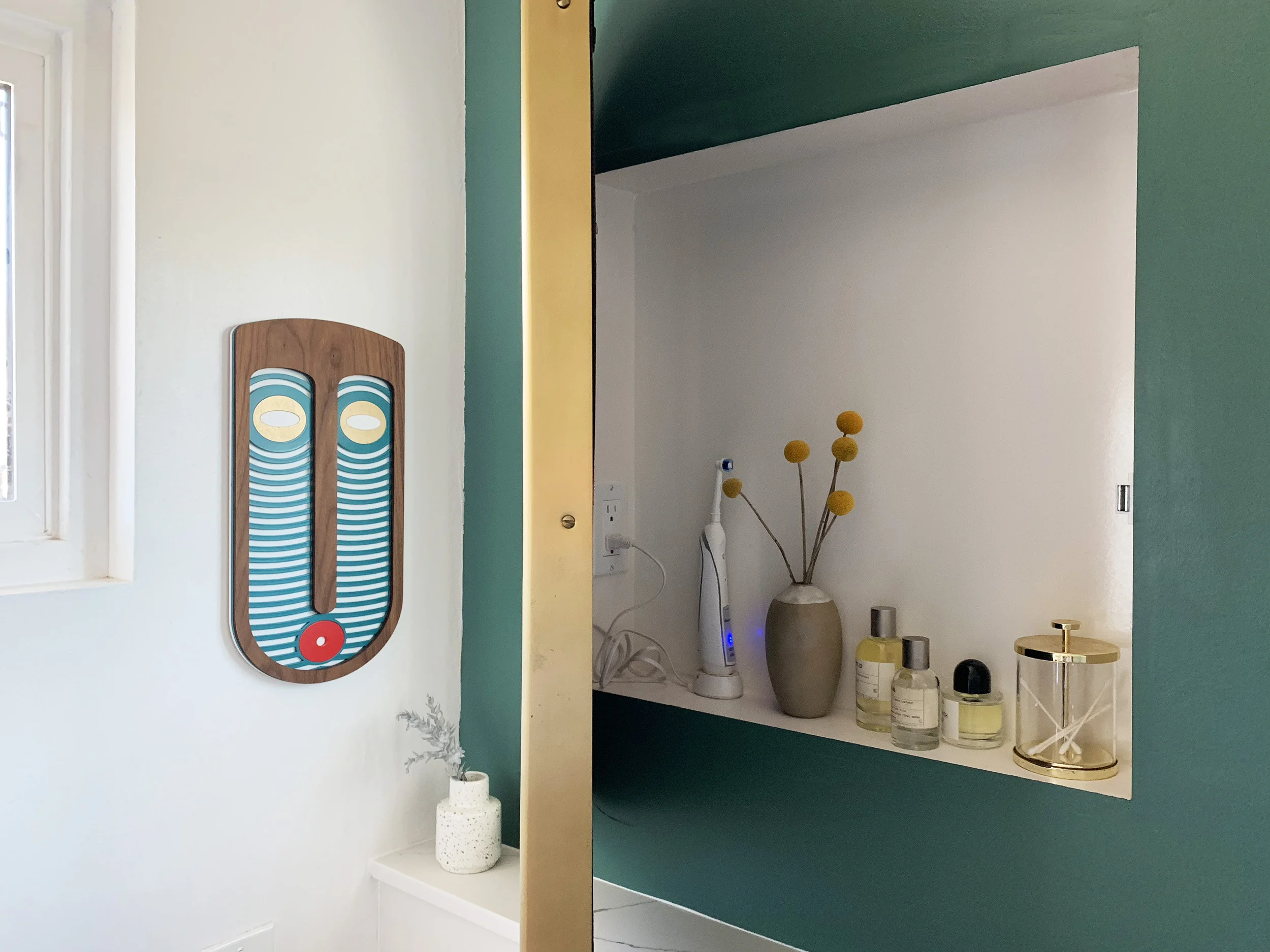
And let’s not forget one of my favorite things I added is this DIY arched medicine cabinet. I asked my dad to create a niche and then used a piano hinge to attach a brass arched mirror to it. Also, I love that we put an outlet in there to hide my electric toothbrush wire. It’s all in the little details! We still need to put some shelves in. The floating cabinet below adds a modern touch and makes the space feel more open.
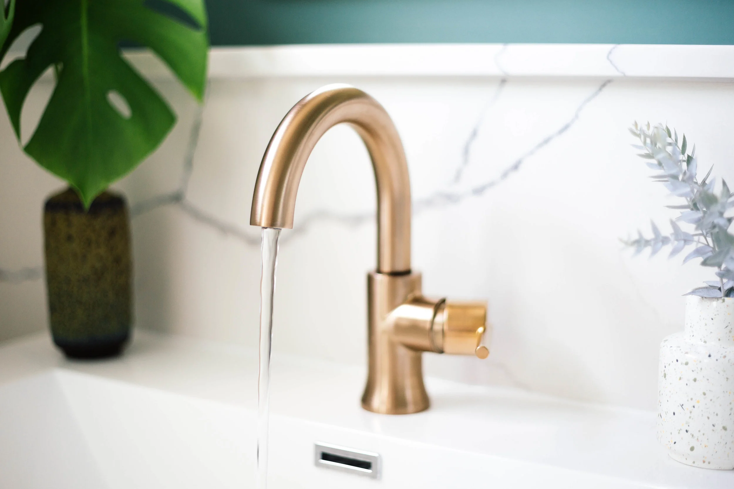
The single handle high-arc faucet continues the arch in the mirror. I like that it swivels so it gives me a little more control. I actually like to give my hair a quick rinse in the sink every morning so this swivel is perfect. All the curves create a nice contrast from all the geometric shapes.
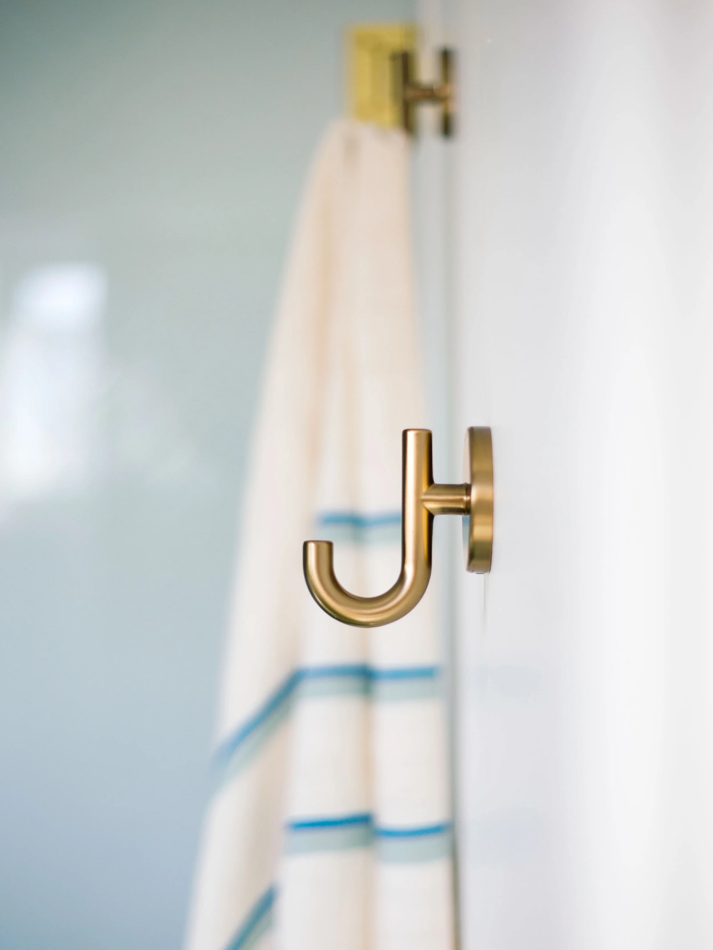
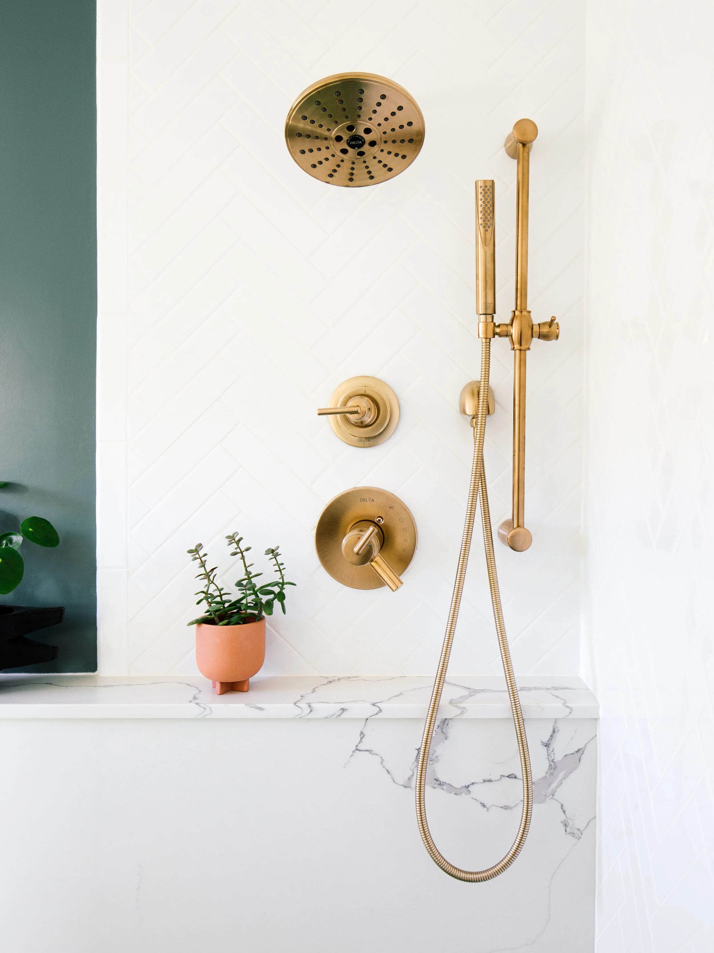
The walk-in shower feels more open and fits our needs better. We never bathe. I opted for both a showerhead and handshower to create a luxurious spa-like experience in the comfort of our own casa. The Delta 17T Series Shower Trim gives you more control and uses 20% less water without compromising water pressure. It’s amazing. The handshower also makes it easier to clean hard to reach places, water plants, and bathe our pups! I’m also obsessed with these Delta robe hooks.
And finally, here’s a fun short video we made for our bathroom makeover. In the video, I share 5 ways to add a bold impact to a small bathroom. Check it out!

