Sophia & Rana’s Makeover Part 3: The Bedroom
Sponsored by AllModern
Welcome to the final part of Sophia and Rana’s makeover. To give you a little background, I’ve partnered up with AllModern to give one of my favorite couples a total home transformation. These two recently celebrated their 10th anniversary of living in this NYC pad, and they were dealing with a few challenges. For one thing, they’re both educators, and have been working part time from home, so their home also doubles as their workplace. They also had a ton of old, hand-me-down furniture they were ready to part with, so it was an ideal time to give them the home of their dreams.
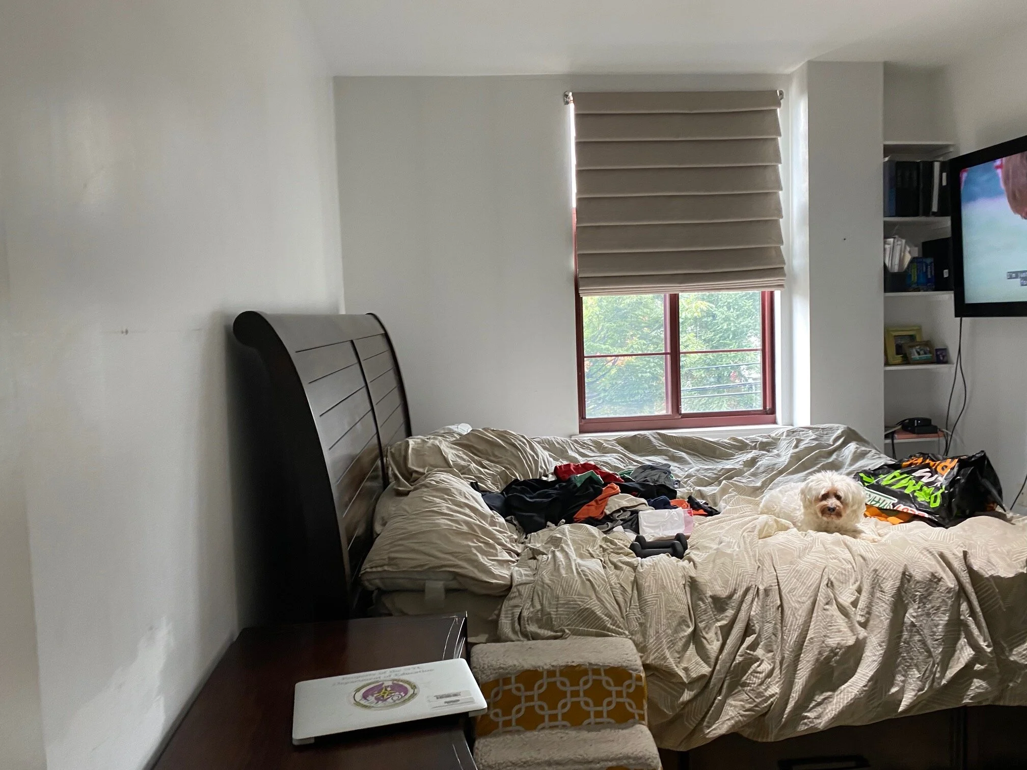
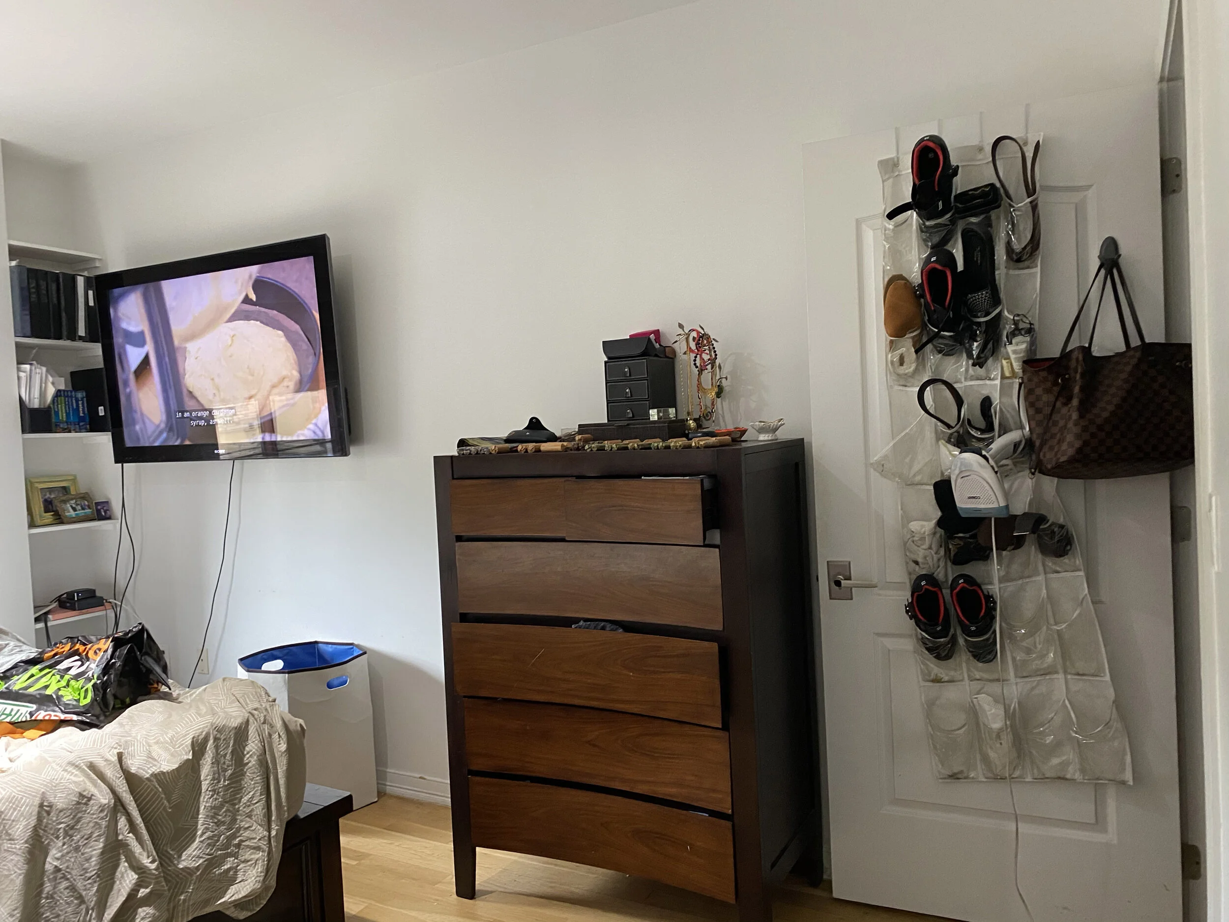
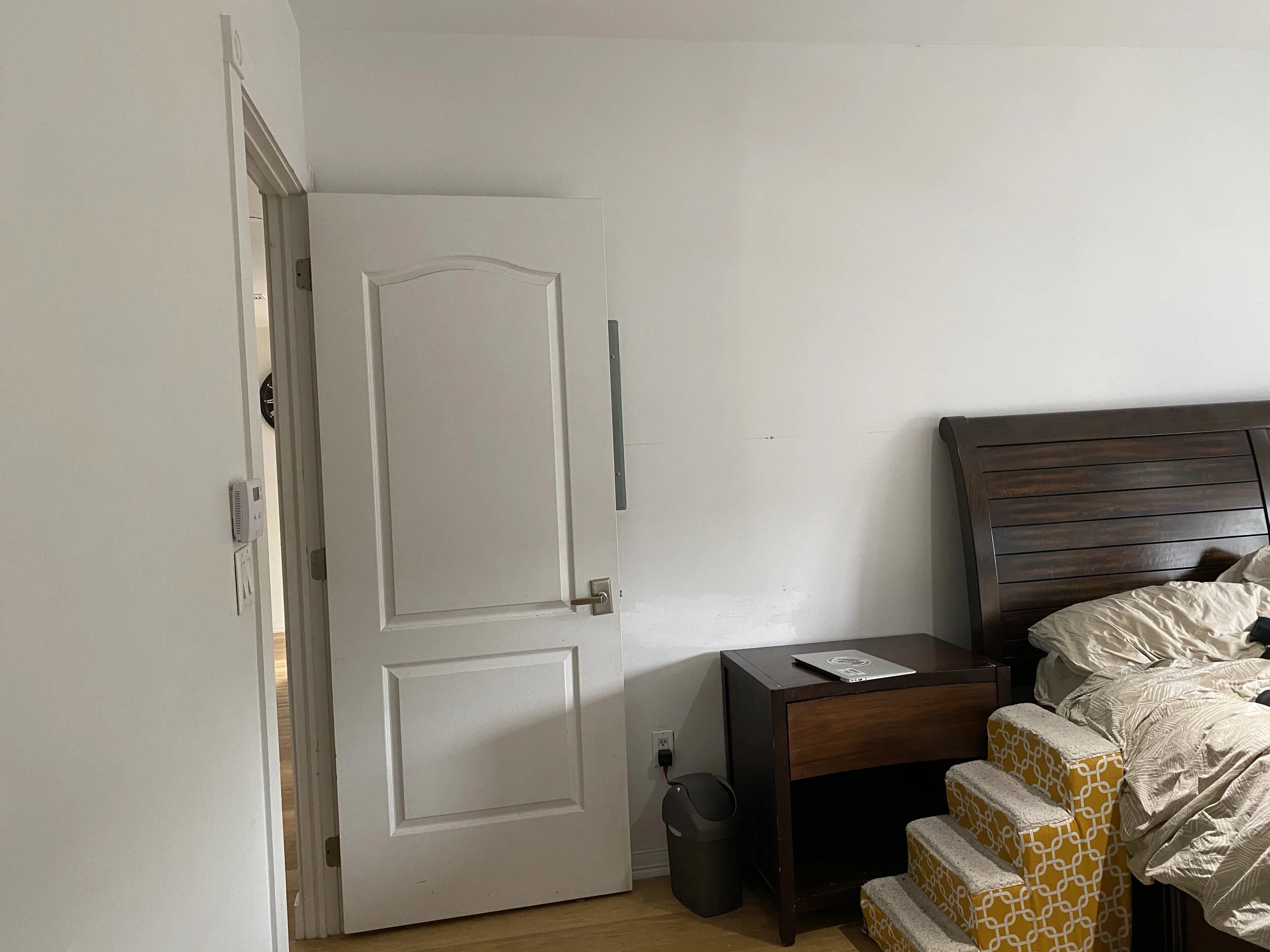
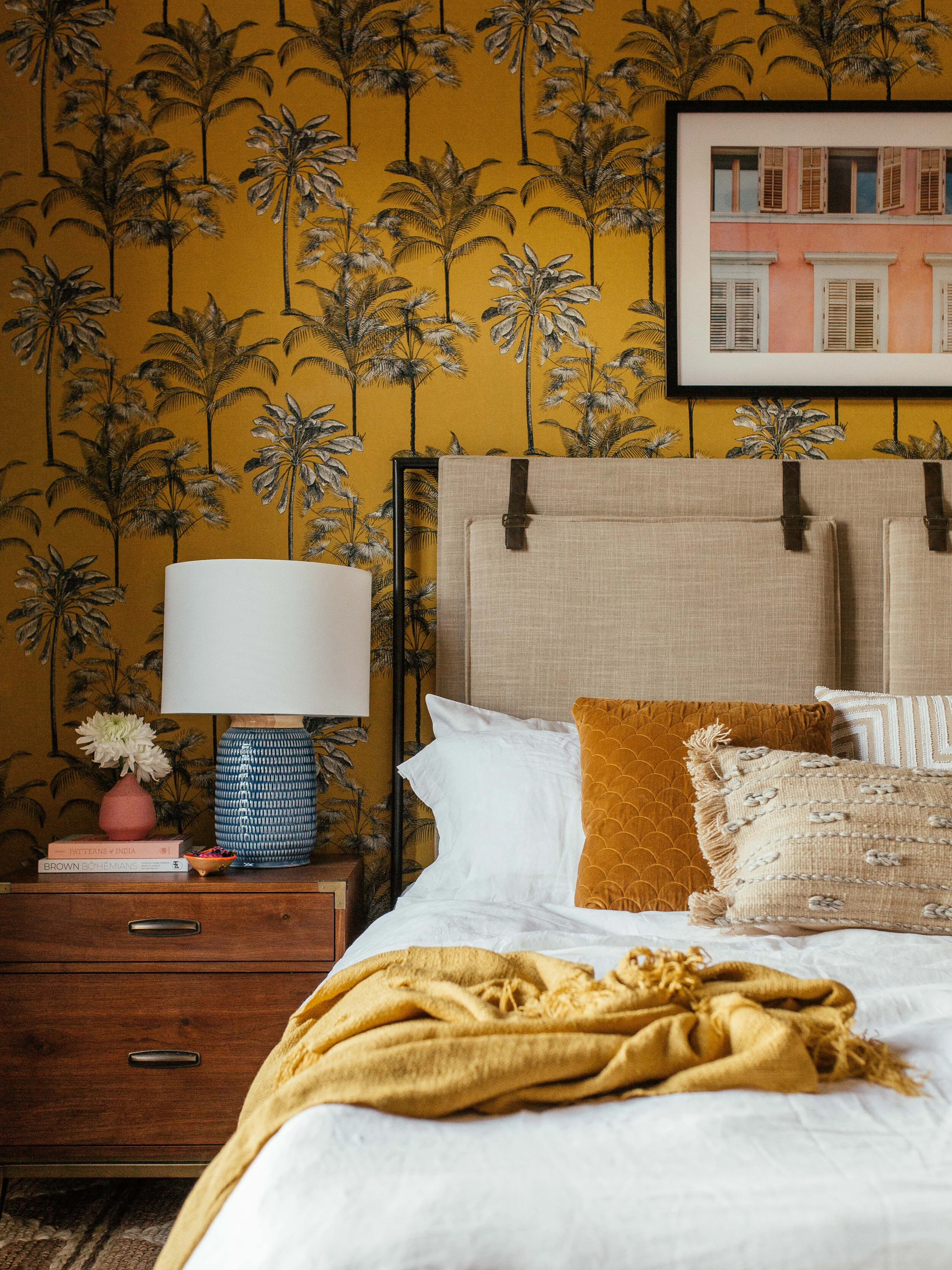
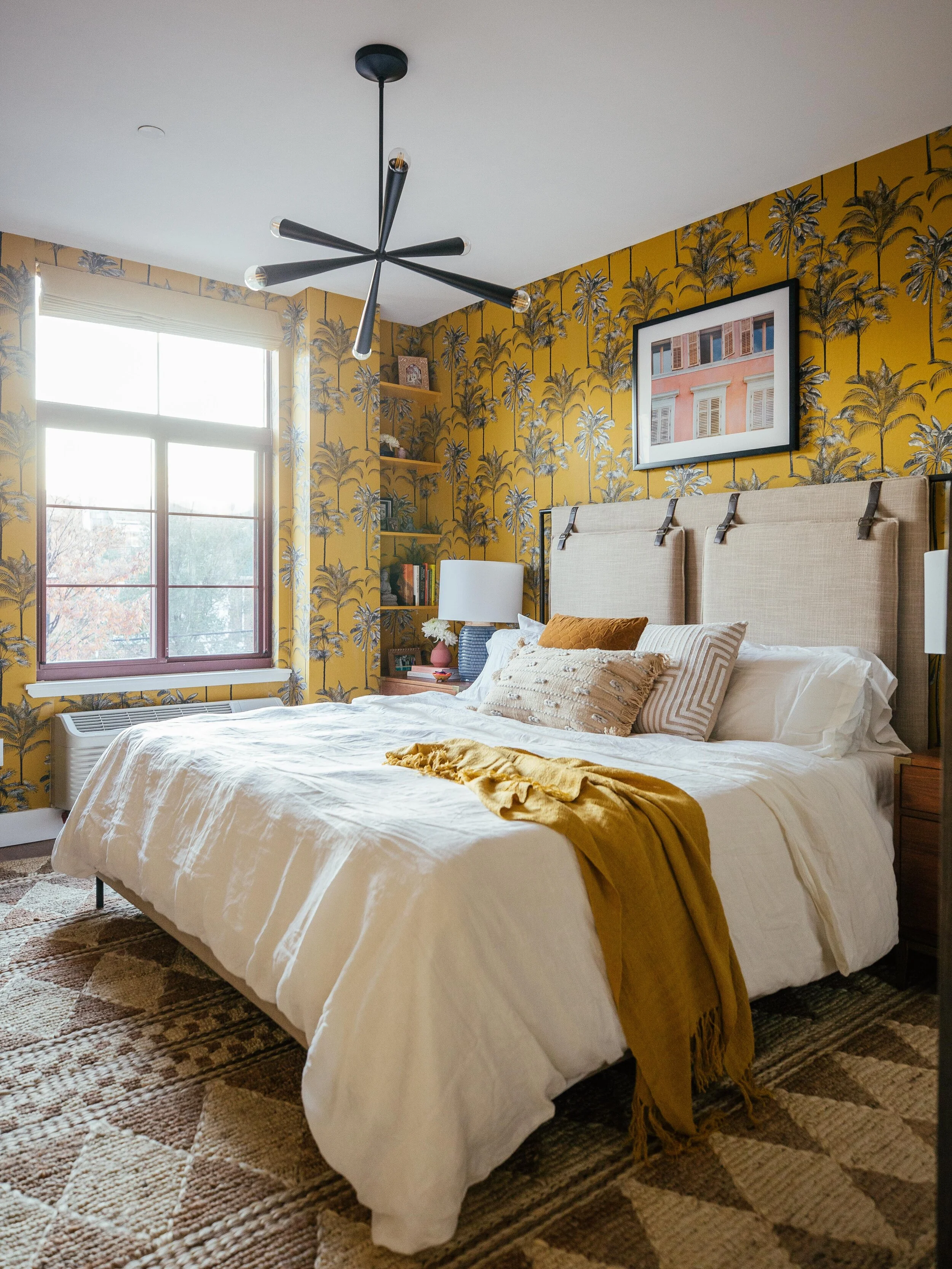
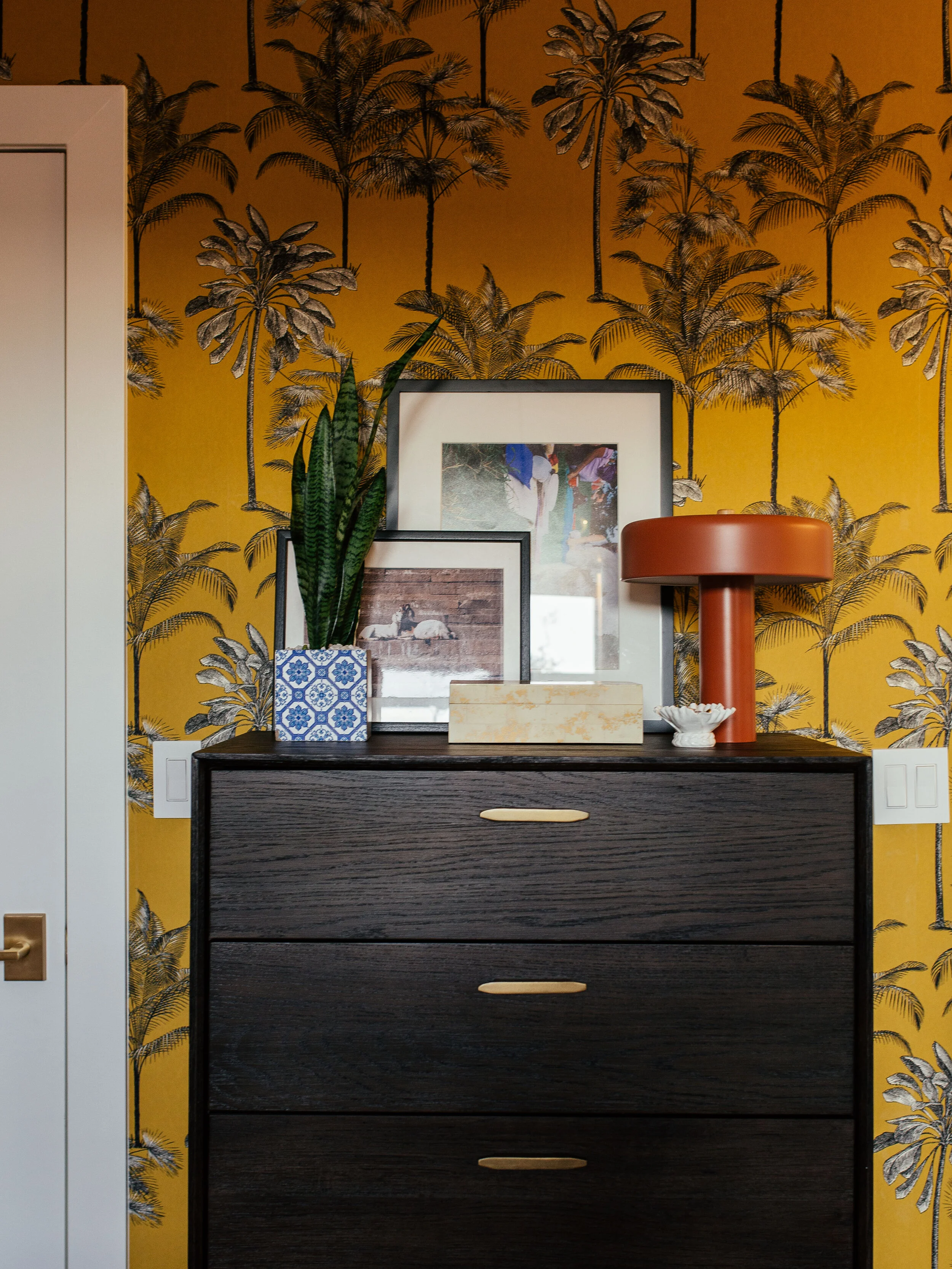
Sophia and Rana love to travel, and since they haven’t been able to vacay this year, they wanted their bedroom to feel like they were on vacation in some tropical wonderland. So I picked out this bright, saffron tropical wallpaper to help set that tone. I’m not gonna lie, this bedroom is kind of a hot mess. The matching furniture set isn’t terrible but they’re not great. The bed frame is way too bulky and when you have a small space you want to maximize every inch. That headboard took up about a foot. And don’t even get started about the layout. Sophia has been sleeping with the doors open facing the front door this entire time! And there’s no table lamp either. I don’t wanna get into feng shui too much but there is an unsettling energy when you’re sleeping so close to the bedroom door which also leads to the front door. Right?
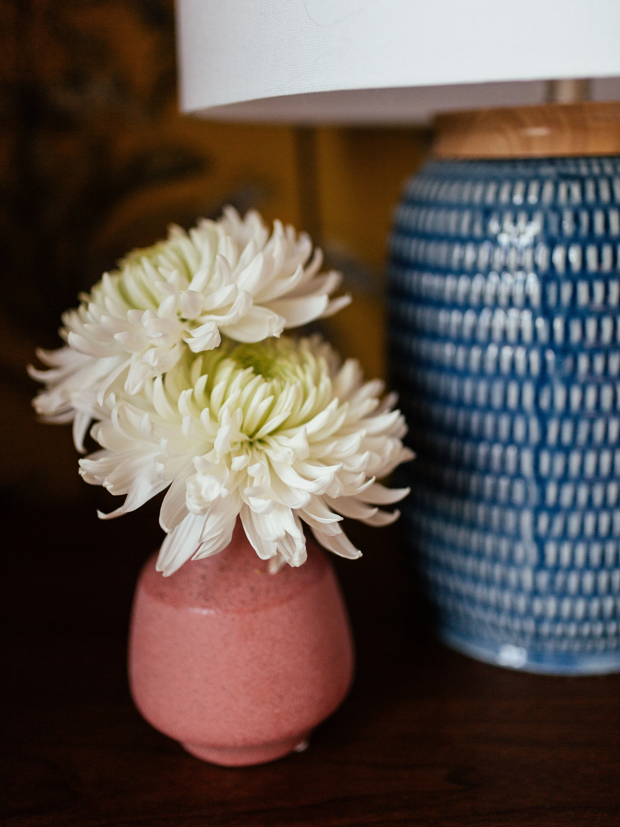
They were down to donate all their furniture and do some more purging and organizing in here. First, we needed to change the layout. Instead of having the bed face the front door, I moved it to the opposite wall. It’s so much cozier this way and flows way better. You get a sense of privacy as well. We got matching nightstands paired with blue ceramic lamps. For the new bed frame, I picked out this upholstered one in a neutral tone. I also went neutral with the jute rug because the wallpaper was such a statement. It still has some geometric pattern on it to make it interesting. And then I sprinkled in some colors through wall art, tomato-colored lamp, rust-colored planter, throw blanket and pillows.
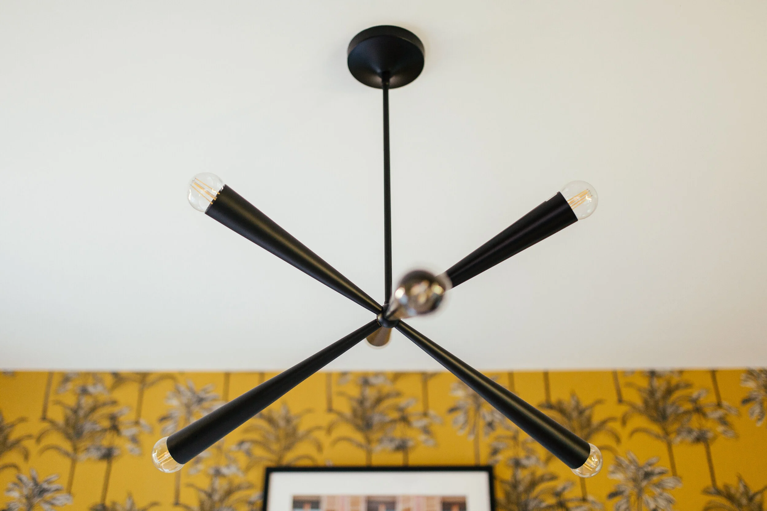
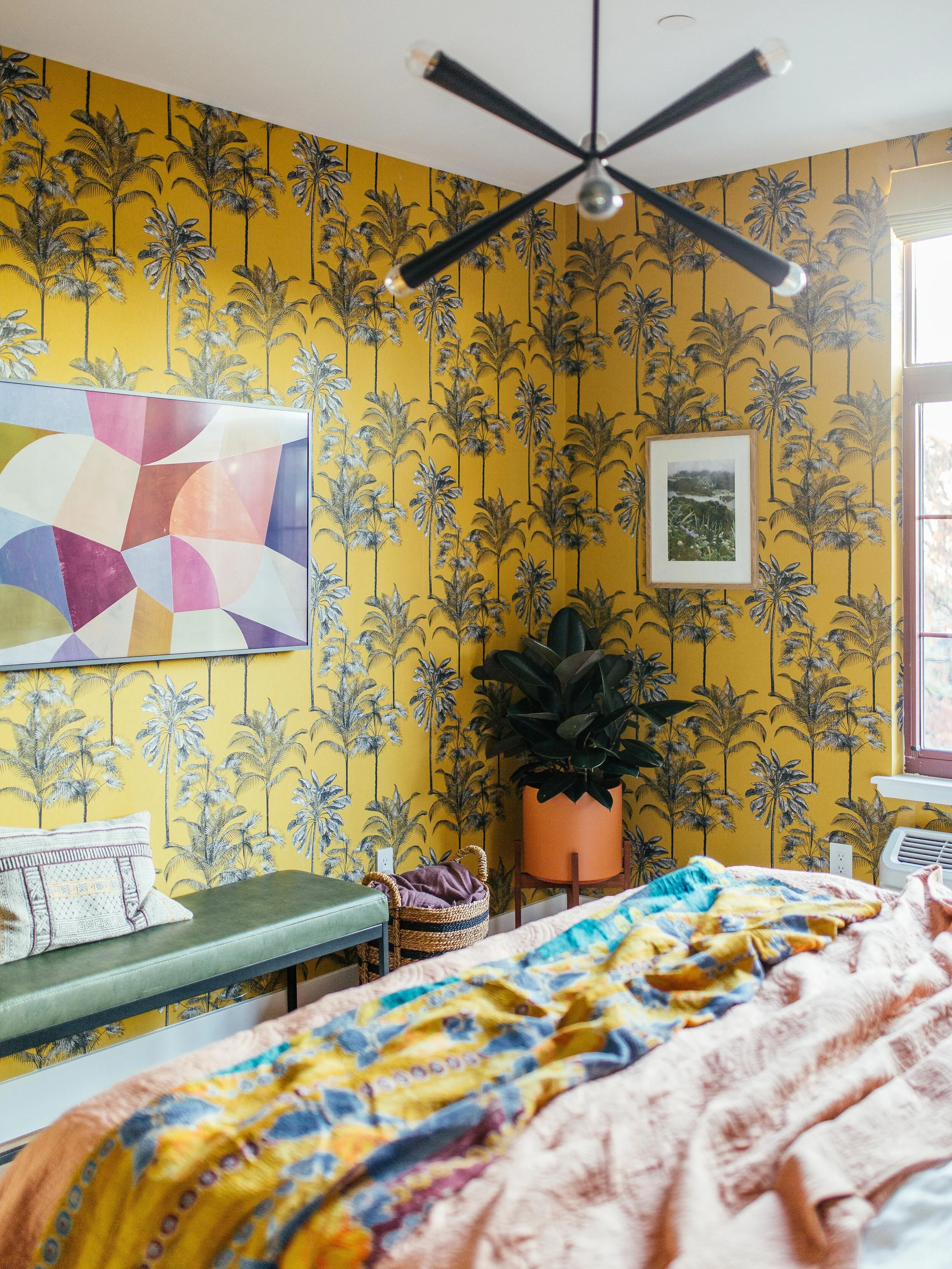
This mid-century style chandelier is a statement piece. I love that it also has a similar shape to the palm trees in the wallpaper. The faux-leather bench is placed under their Frame TV to anchor that space and we placed a basket next to it to hide all the wires and router. Along the opposite wall, I placed a Mid-Century style dresser to add storage. We made sure to toss in a few more details to carry out the vacation vibes like framed photos of far-off destinations snapped by Sophia and Rana. They love this space so much! Thanks to brand new pieces from AllModern, now their bedroom is the relaxing, resort-inspired space they’ve been craving — and that they absolutely deserve. It will surely tide them over until their next vacay, and I think they’re going to be pretty happy here. And there you have it! I hope you all enjoyed this makeover. Thank you for following along.
You can catch up on the other spaces: Entryway & Living Room.
Get This Look
Bedframe
Nightstands
Blue table lamps
Drawer chest
Tropical wallpaper
Jut rug (no longer available)
Green Bench
Lumbar pillow on bench
Sputnik chandelier
Pink vase
Tomato lamp
White linen duvet set
Yellow throw
Rust planter
Pillows on bed (style 1, style 2)


