Master Bathroom Before & After
I'm so excited to share my master bathroom makeover with y'all! I honestly can't believe I finally have these classic cube cement tiles in my home. I've been coveting them for many years and never had the opportunity to use them until now. I knew they would be the perfect tiles for my bathroom after my recent trip to Chicago for A Day of Inspired Design with Delta Faucet. I was so inspired by the city’s geometric shapes so I brought those elements into the bathroom wherever I could, in the form of hexagons and octagons.
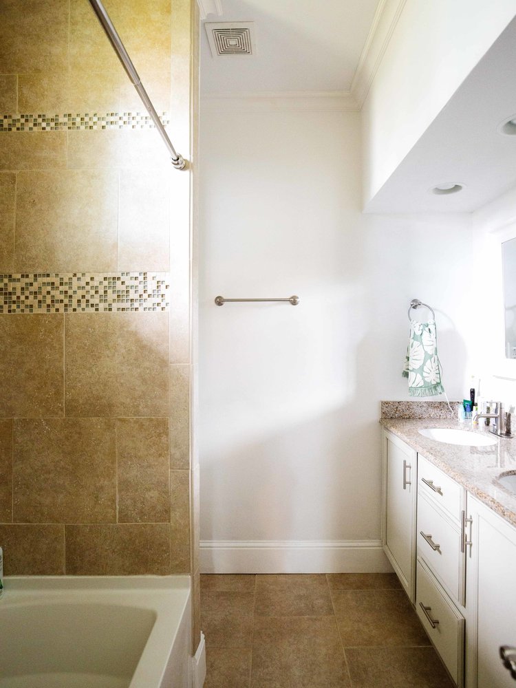
Let’s take a look at what the bathroom looked liked. Remember this sandy-colored mess? We took out the tub, removed the tiles, and replaced the vanity top.
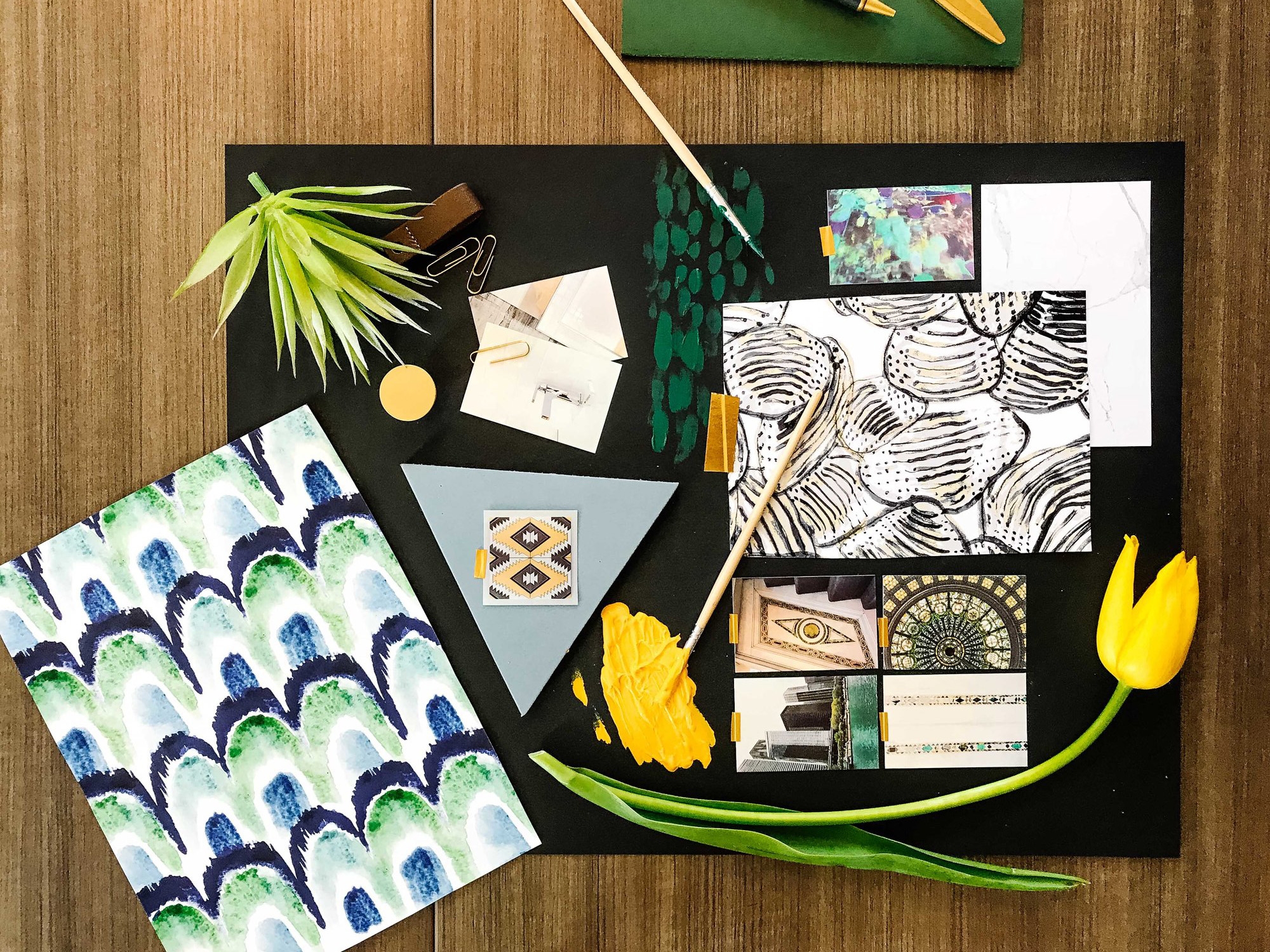
Here's the mood board I created for the Delta design challenge which I also won. I was really inspired by the patterns and movements in SheShe’s works. I found that yellow tulip on a sidewalk next to the Chicago Cultural Center by the way, as if I needed any excuse to bring in yellows into a room. Yellow energizes and inspires me. To compliment it, I wanted to pick a color that also calms and recharges, so I chose an aqua green color. I love a bathroom with bold patterns and textures.
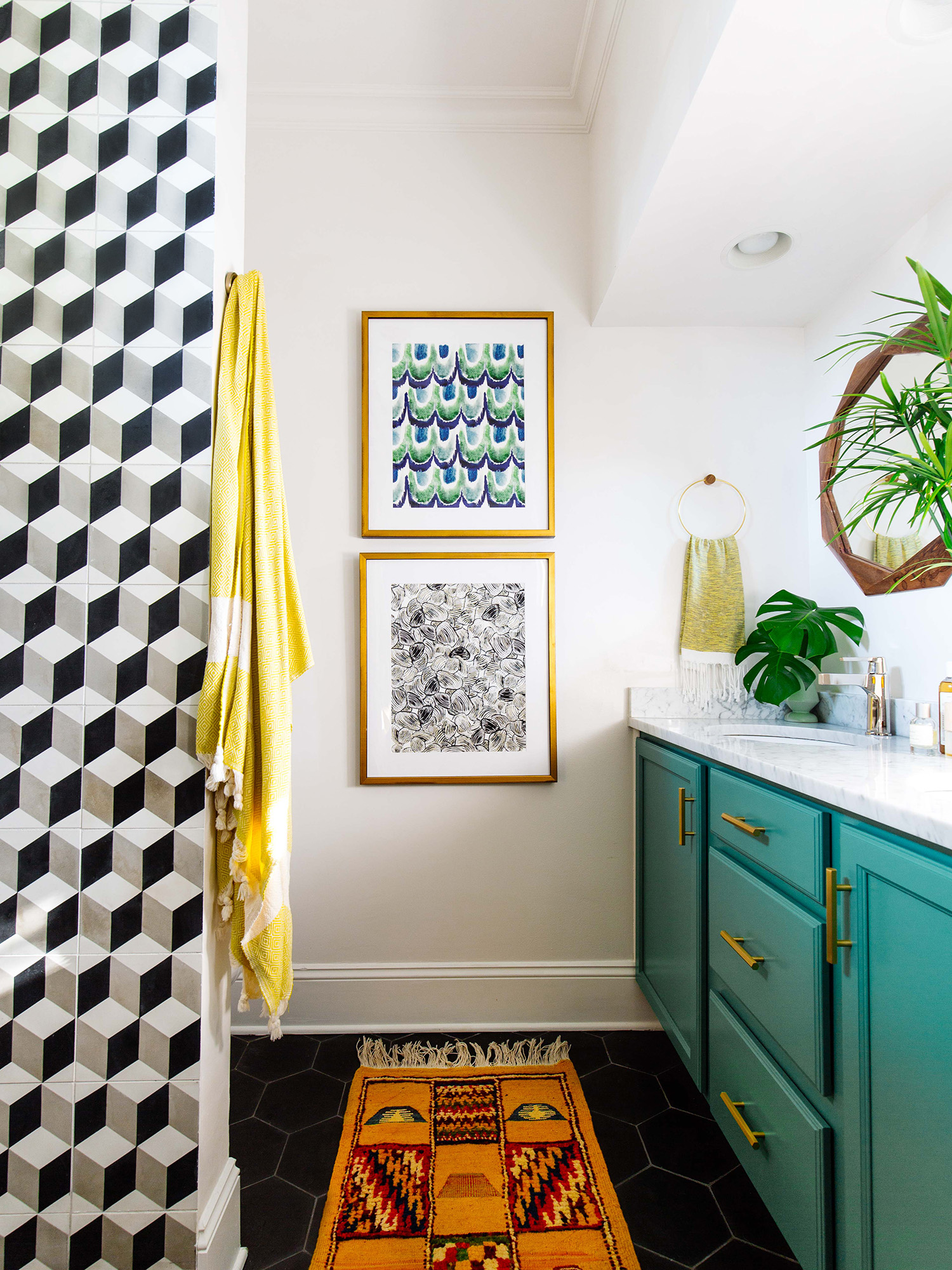
And boom! The bathroom feels much bigger now after the tub is gone. We now have color and contrast! I played with the idea of installing the cube tiles on the floor instead of on the walls. Because it's such a small space, it wouldn't be as dramatic. And I wanted them to be the first thing you saw when you walked into the bathroom. Seriously, I could be in here all day.
We replaced the sink with white Carrara marble I found at a local marble shop for a steal. They're so classic; you can't go wrong with them. And check out our new Delta faucets in Polished Nickel from the Zura® collection. It has geometric elements which tie in perfectly with the cube tiles, hex handles, and octagon wooden mirrors. It has a very subtle, warm tone, like the color of champagne. Speaking of champagne, we also chose the Delta Vero® Shower Trims in Champagne Bronze™. I wanted a rain shower effect without having to put one in the ceiling so this is perfect.
We're still debating whether we want to keep the shower curtain or if we want glass shower doors. What do you guys think? What I like about the shower curtain is that it feels more open. But shower doors would make it look more sophisticated, don't you think?
These are the beautiful custom prints I won from the Delta design challenge, designed by SheShe. I love how they capture the organic elements of nature and water. They’re bold yet soothing at the same time. They work perfectly in the bathroom as they soften the geometric shapes. I had them framed in gold with black sides.
I added a new brass light fixture and brass hardwares. I wasn’t kidding about my love for hexagons and octagons!
I considered removing the shower wall divider to open up the space even more, but it's there to hide the toilet and I've never been a fan of seeing a toilet in a bathroom, so we left it as-is. For the floors, we chose black hexagon cement tiles. It was my first time using cement tiles and they require a different process. If you ever go this route, make sure your contractor understands how to install them. Our runner is from Morocco and it’s the only rug we bought when we were there. Can you believe I didn’t buy a container of rugs?
I'm so happy with how our bathroom turned out. Sweet thanks to Delta Faucet for partnering with me and helping me design my dream bathroom!
Sources
Faucets • Delta
Shower Trim • Delta
Art • SheShe
Cube Tiles • Villa Lagoon Tile
Hex Tiles • Villa Lagoon Tile
Frames • Framebridge
Mirrors • World Market
Brass Hex Handles • CB2
Towel Hanger • Ferm Living
Door Knob • Emtek
Gold Tension Shower Rod
Yellow Turkish Towel
Flushmount Light • West Elm
Moroccan Runner
Paint • Sherwin Williams Surf Green
▽
Check out the other Designers’ Makeovers Below
Simply Grove | Grandbaby Cakes | Yellow Brick Home | Making Home Base | Julie Blanner
The Ugly Duckling House | Copy Cat Chic | Bless'er House | Driven By Decor


